Client:
Piece of Cake
Service:
Brand Identity
English language teachers approached me with the goal of taking their business to the next level by creating an online school. Their objective was to establish a strong online presence and build a community around their English learning platform. They came to me with a branding concept that didn't align with modern trends or market style; the chosen colors overwhelmed the visuals and failed to convey the brand's values and meaning. They were unsure where to start, had no clear vision of the desired outcome, and were dissatisfied with their current branding. They were attracted to my working style and my ability to deliver projects within tight deadlines, so they sought my expertise.
Objectives:
Challenges: The online English school market is highly competitive, with hundreds of players offering similar services. Piece of Cake needed to not only create an online school but also become a vibrant and recognizable brand that attracts attention and earns trust.


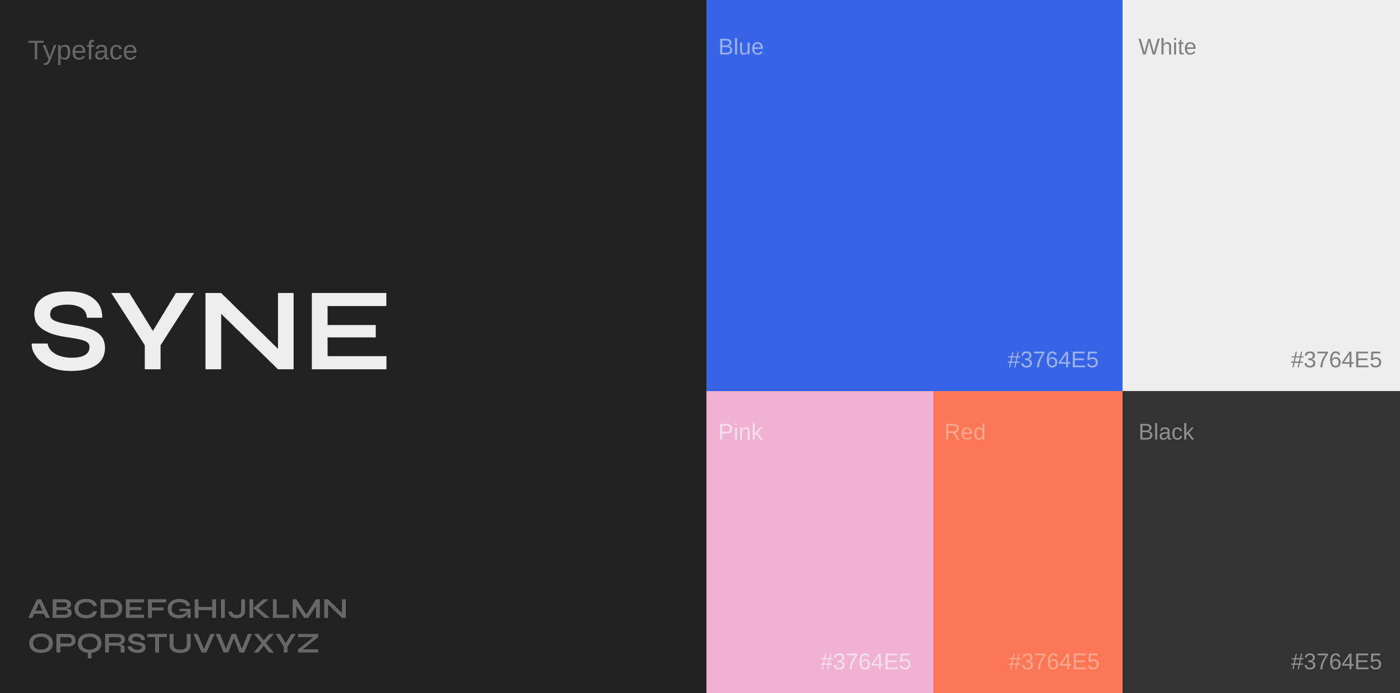


We adopted a comprehensive approach based on in-depth market and audience analysis. We chose the brand name Piece of Cake, a memorable play on words that accurately reflects the company's mission of making learning English easy.
Logo: Instead of conventional text-based solutions, we created a creative logo resembling layers of a cake. This design evokes the image of a stack of books, symbolizing the journey of learning English.
Color Palette: A bright and attractive palette reflects a friendly atmosphere, simplicity, ease of learning, and the brand's key values: progress without pressure.
Fonts: Readable and modern fonts emphasize Piece of Cake's professionalism and ensure comfortable information consumption.
Based on the needs and "pain points" of the target audience, we developed a content strategy and visual design that engage the audience visually. The visuals became more recognizable through bright and clear illustrations in the brand's style. We created a rubricator with interactive content aimed at various goals: engagement, learning, sales, and entertainment. Each section (e.g., correct pronunciation with native speakers, translation guessing, using modal verbs, language learning tips) was designed with a unique style, allowing subscribers to instantly understand the topic through colors and design.
Additionally, I designed several banners used in school advertisements that effectively conveyed the community's essence.
Learning English with Piece of Cake means more than just having a tutor; it means joining a community united by a thirst for knowledge, discovery, simplicity, and enjoyment of life.
Our work resulted in a design that accurately conveys the brand's values and mood, distinguishing and highlighting Piece of Cake from market competitors.


